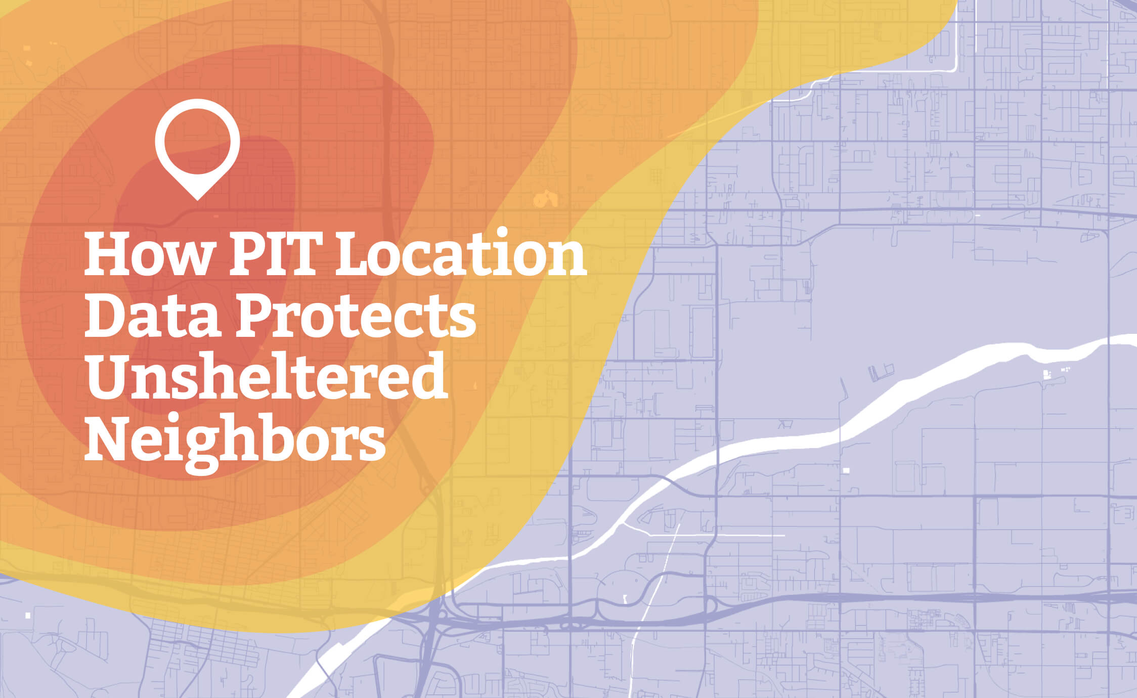
How PIT Location Data Protects Unsheltered Neighbors
Outreach workers understand better than anyone that where can change everything.
Where someone sleeps when a storm rolls in.
Where a heat wave hits hardest.
Where a crisis erupts when there are only a few hours to act.
For unsheltered neighbors, safety often depends on whether someone knows their location at the exact moment conditions shift from uncomfortable to dangerous. For outreach teams, that “where” can be the line between a coordinated response and a scramble built on guesswork.
During our latest webinar, From Counts to Coordinates: Integrating PIT Location Data into Your Strategic Outreach, Angela Evans from Bitfocus and Dr. Este Geraghty from Esri shared real examples of communities that faced that line. Their stories showed something simple and hard to ignore: when PIT, GIS, and HMIS work together, location data stops being dots on a map and starts being one of the most effective tools for keeping people safe.
This piece looks at what those stories teach and what changes when communities know where people are before danger arrives.
Location Data Meant Getting There in Time
San Bernardino County’s experience shows exactly what’s at stake.
Months before a major storm, the county carried out a digital unsheltered PIT count using ArcGIS Survey123. Instead of relying on vague descriptions or rough landmarks, staff and volunteers recorded precise locations for people living in a natural floodplain, off the beaten path and out of public view.
Later that year, heavy rain pushed reservoirs to their limits. Dam operators announced an emergency release of excess water. The clock started ticking. The floodplain where many encampments sat would not stay dry for long.
In many communities, this is the point where people start guessing. Outreach leads pull up mental maps and old notes. Staff trade texts: “I think there’s a camp near the river.” “Didn’t we see tents off that road last month?” Volunteers do their best with incomplete information and hope they don’t miss anyone.
San Bernardino did something different. Because the PIT data had captured accurate locations and that data lived in a secure system, outreach teams already knew where people were staying. A central operations center coordinated routes. Teams navigated directly to each encampment. They did not wander floodplains hoping to stumble onto camps. They followed actual coordinates.
Everyone in the danger zone got out in time.
There was no dramatic movie scene, just workers and volunteers doing their jobs with better information. The difference between “we think people are out there” and “we know exactly where they are” translated into lives protected.
The takeaway is not about the storm. It is about what happens when you stop guessing where people are in the first place.
Location Data Prevents People From Being Overlooked
Not every danger looks like a fast-moving flood. Sometimes harm builds slowly, as people in hidden locations go unseen while visible encampments receive visit after visit.
In Abbotsford, British Columbia, more than a dozen organizations were conducting outreach. Many encampments sat deep in wooded areas, far from main roads. Each group cared about the same population, but they worked with partial information and little coordination.
On hot days, teams hauled pallets of water down long trails to remote sites. More than once, workers arrived drenched in sweat, only to find out another team had dropped water there ten minutes earlier. Extra water never hurts, but every duplicated trip meant another encampment somewhere else received nothing.
Over time, a pattern formed:
- Some sites saw repeated visits.
- Others stayed off the radar entirely.
- Staff felt exhausted, guilty, and unsure who they were missing.
When the community began collecting and sharing privacy-protected location data, the picture changed. Encampment locations appeared on a shared map. Teams could see where others planned to go and where no one had scheduled a visit.
Instead of guessing, they could:
- Coordinate routes across organizations.
- Confirm that each camp had someone assigned.
- Redirect effort from over-served spots to overlooked ones.
The risks here were quieter than a flood, but no less real. People in unseen encampments missed water, food, check-ins, and information about services. Location data did not just save time or fuel. It helped prevent people from slipping through the cracks simply because no one had a clear view of where they were.
The San Bernardino and Abbotsford stories share the same core truth: when you know exactly where people are, you can protect them from both sudden danger and slow, silent neglect.
Spotting Gaps Before They Become Crises
Maps do more than show where outreach teams have been. They reveal where they haven’t and, at times, why they haven’t.
When outreach relies on memory, paper lists, or text threads, coverage almost always skews toward the familiar. Teams return to known hotspots and visible locations. Fringe neighborhoods, industrial corridors, rural edges, and tucked-away spaces quietly fall off the rotation.
Location-aware data changes that.
When PIT, GIS, and HMIS work together, communities gain a living view of outreach activity:
- Empty stretches on the map flag blind spots where no one has visited in weeks or months.
- Movement patterns show how encampments shift with seasons, encampment sweeps, or local policy changes.
- Layered data highlights where high-need areas lack culturally or linguistically appropriate staff, such as neighborhoods with large Spanish-speaking populations rarely visited by Spanish-speaking outreach workers.
These patterns are not abstract. An empty corridor on a map might reflect people living near a freeway off-ramp who never see an outreach worker, a cluster of tents near a flood channel that no one visits before rainy season, or a camp far from downtown where nobody receives cooling-center information during a heat wave.
Paper lists might feel contained, but they cannot show any of that. Vague, untagged notes cannot reveal who gets missed. Without real visibility, teams only learn about those gaps when something goes wrong.
Used responsibly and with strong privacy protections, modern tools do the opposite. They surface blind spots early enough for communities to respond. They let leaders ask specific questions: Where have we not been? Who lives there? What risks do they face if conditions change next week?
That is the kind of awareness that prevents today’s small oversight from becoming tomorrow’s emergency.
Responsible Data Protects People and Strengthens Outreach
The stories from From Counts to Coordinates were not about software. They were about people:
- Unsheltered neighbors whose safety depends on someone knowing where to find them.
- Outreach workers who want to keep promises rather than hope their memory is enough.
- Communities trying to stretch limited time and resources without leaving anyone behind.
Location data, collected ethically and combined with PIT, GIS, and HMIS, strengthens that commitment. It lets workers act faster when weather shifts without warning, prevents the same few sites from receiving repeated visits while others get none, and shows clearly where people live who haven’t seen outreach staff in too long.
At the end of the day, this work is not about pins on a map. It is about lives in specific places, facing specific risks, on specific days. If you do not know where people are, you cannot get to them when it counts.
To go deeper into these examples and see how communities are using PIT location data to protect unsheltered people, watch the full From Counts to Coordinates webinar. Then ask a simple question about your own community: when conditions change tomorrow, will you know where to go first?